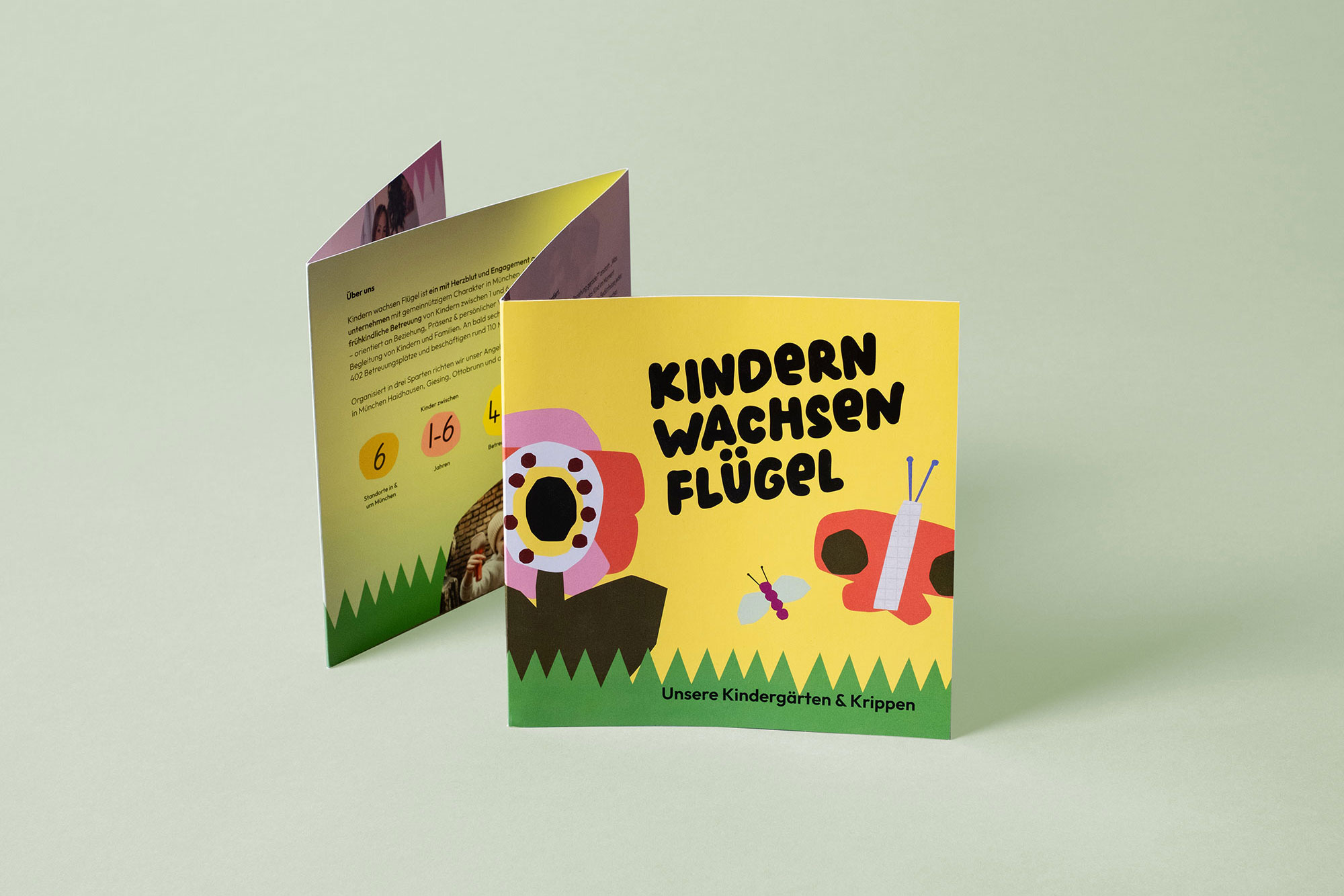
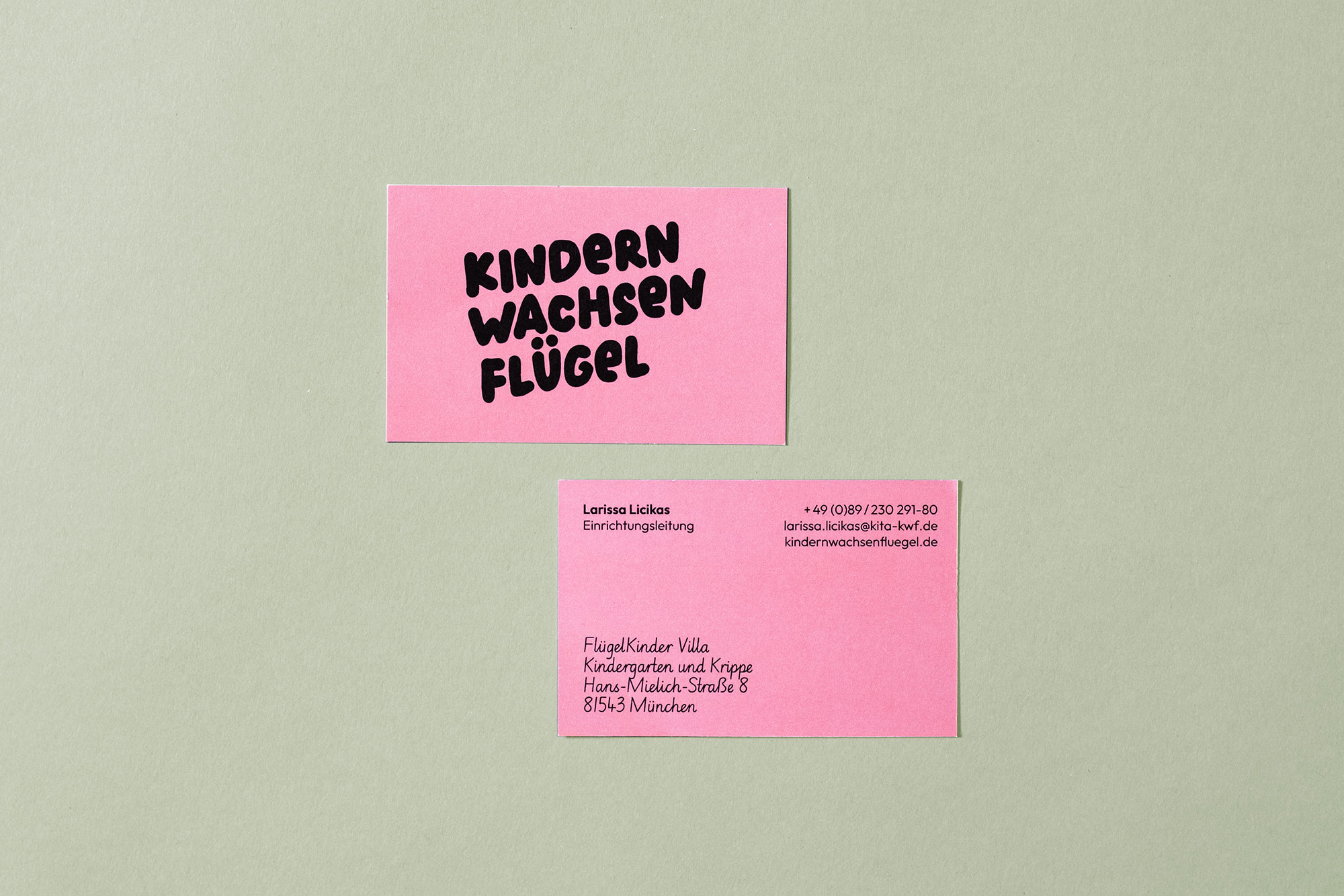
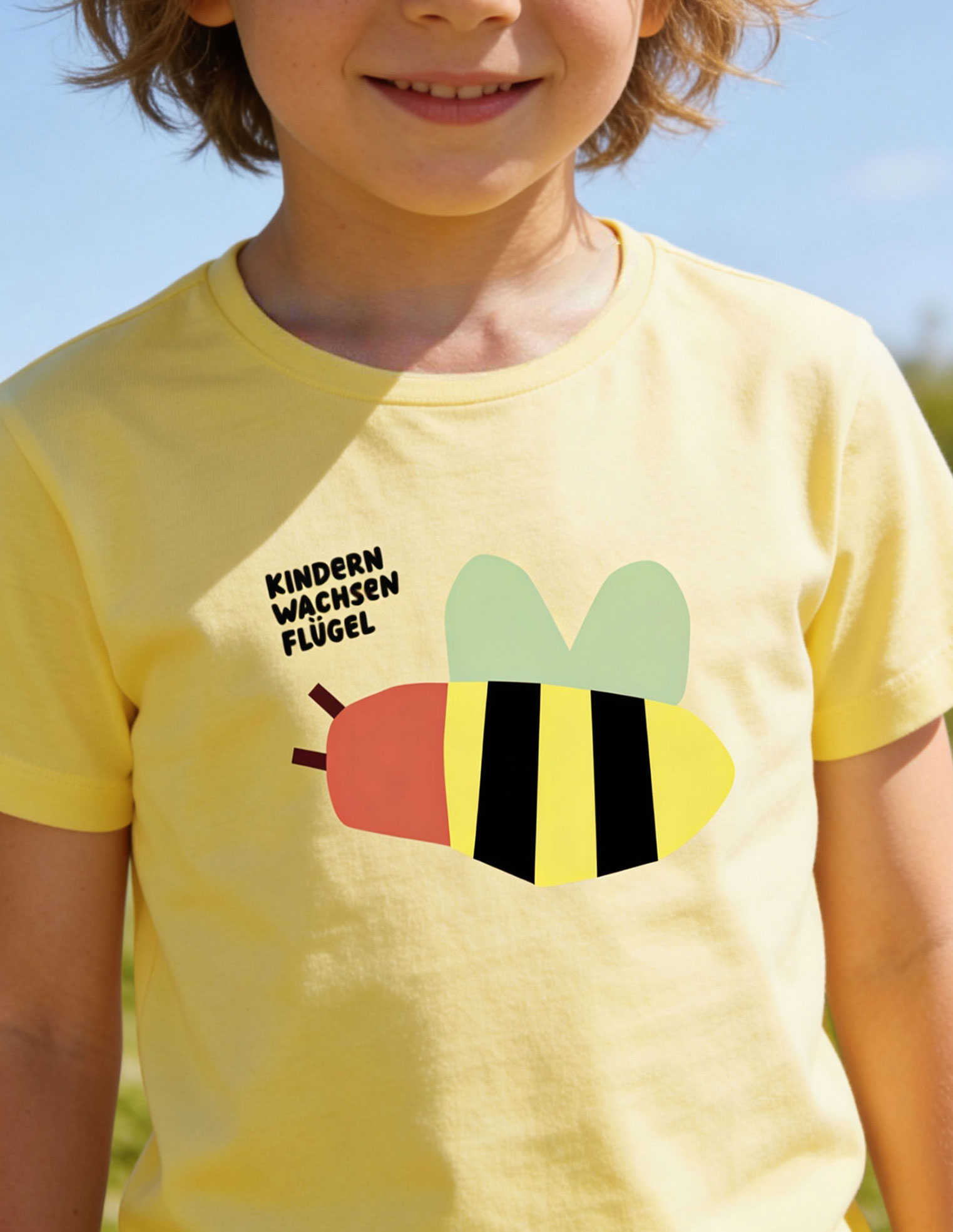
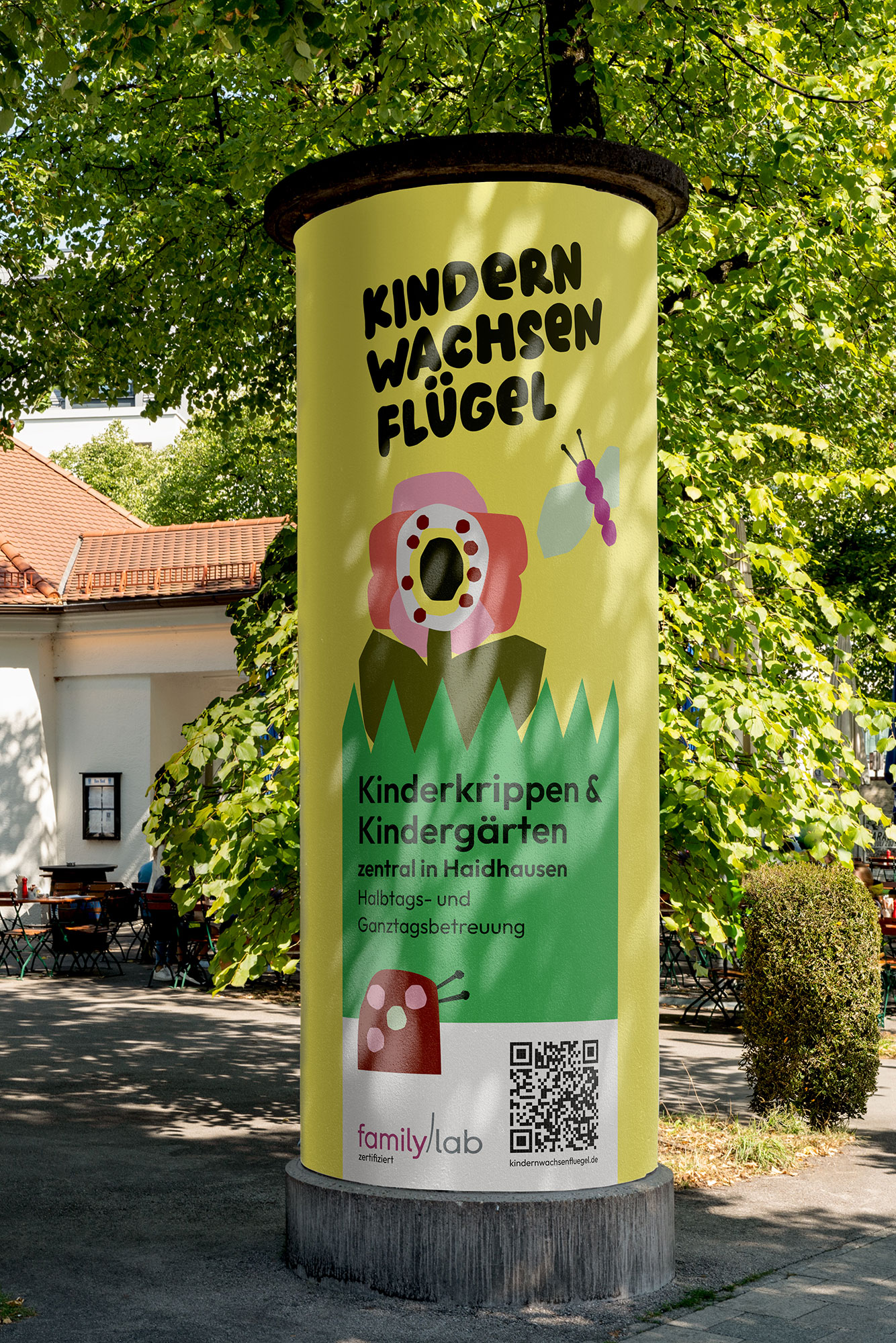
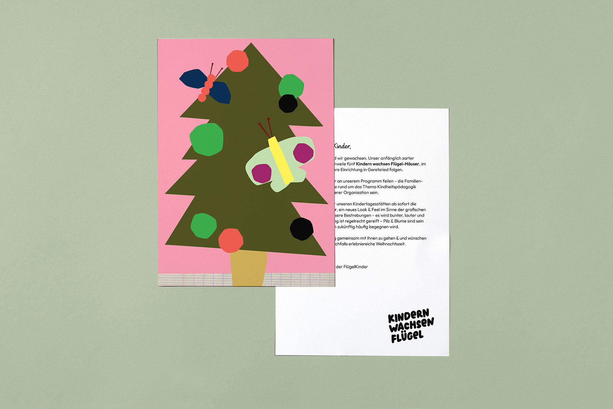
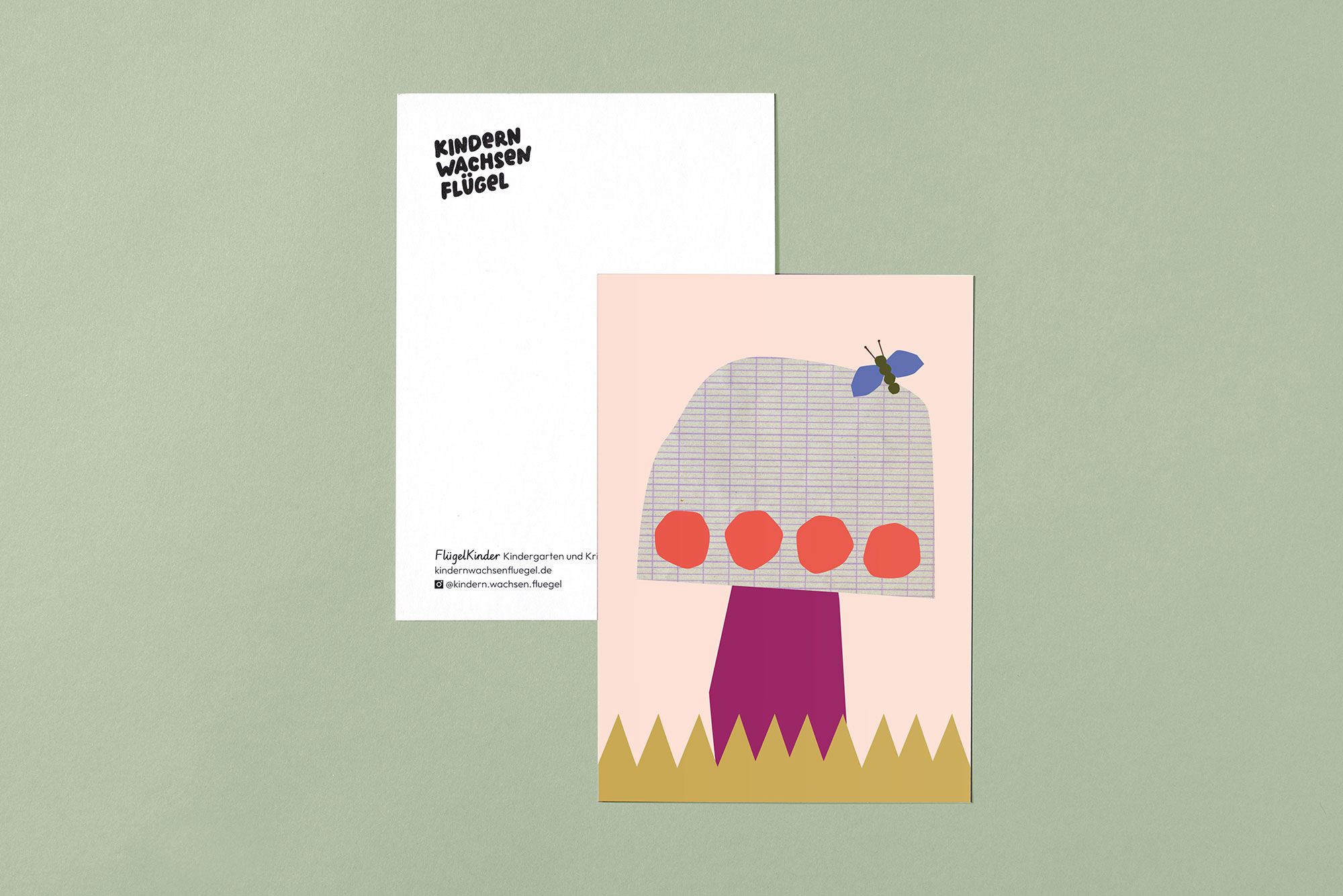
A black logo for a daycare center? Absolutely!
For the logo, I developed a playful, slightly eccentric, hand-drawn typeface featuring bold, friendly letters. The logo is used exclusively in black and white. Set against a vibrant, colorful graphic backdrop, it conveys the team’s vision for the new brand design: clarity and boldness. The irregular shapes also underscore the creative, lively character of the facilities.