“Die Hausärzte Worms” is a general medical practice in Worms.
Last year I had the opportunity to develop a corporate design based on another stunning brand strategy by ohboy.
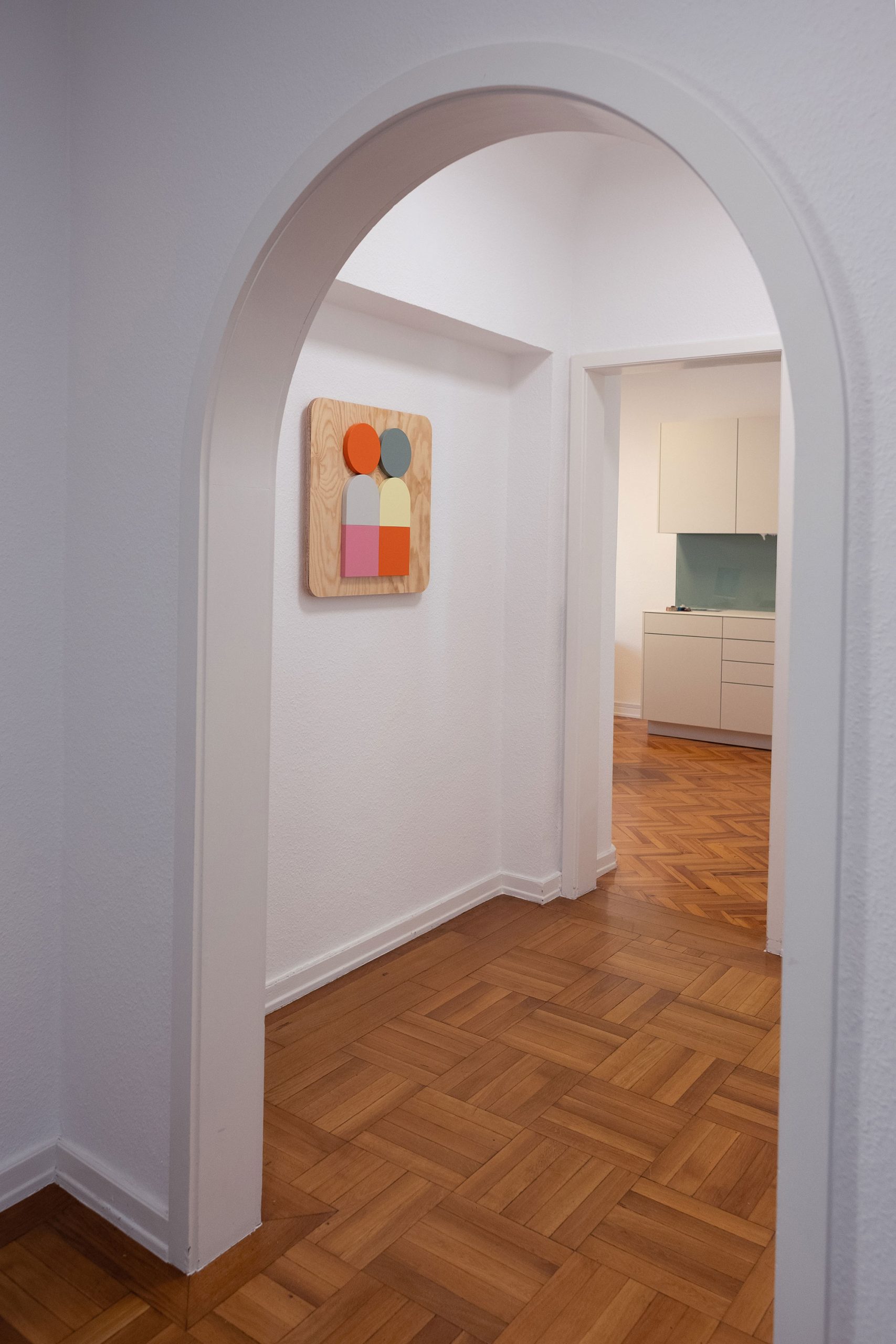
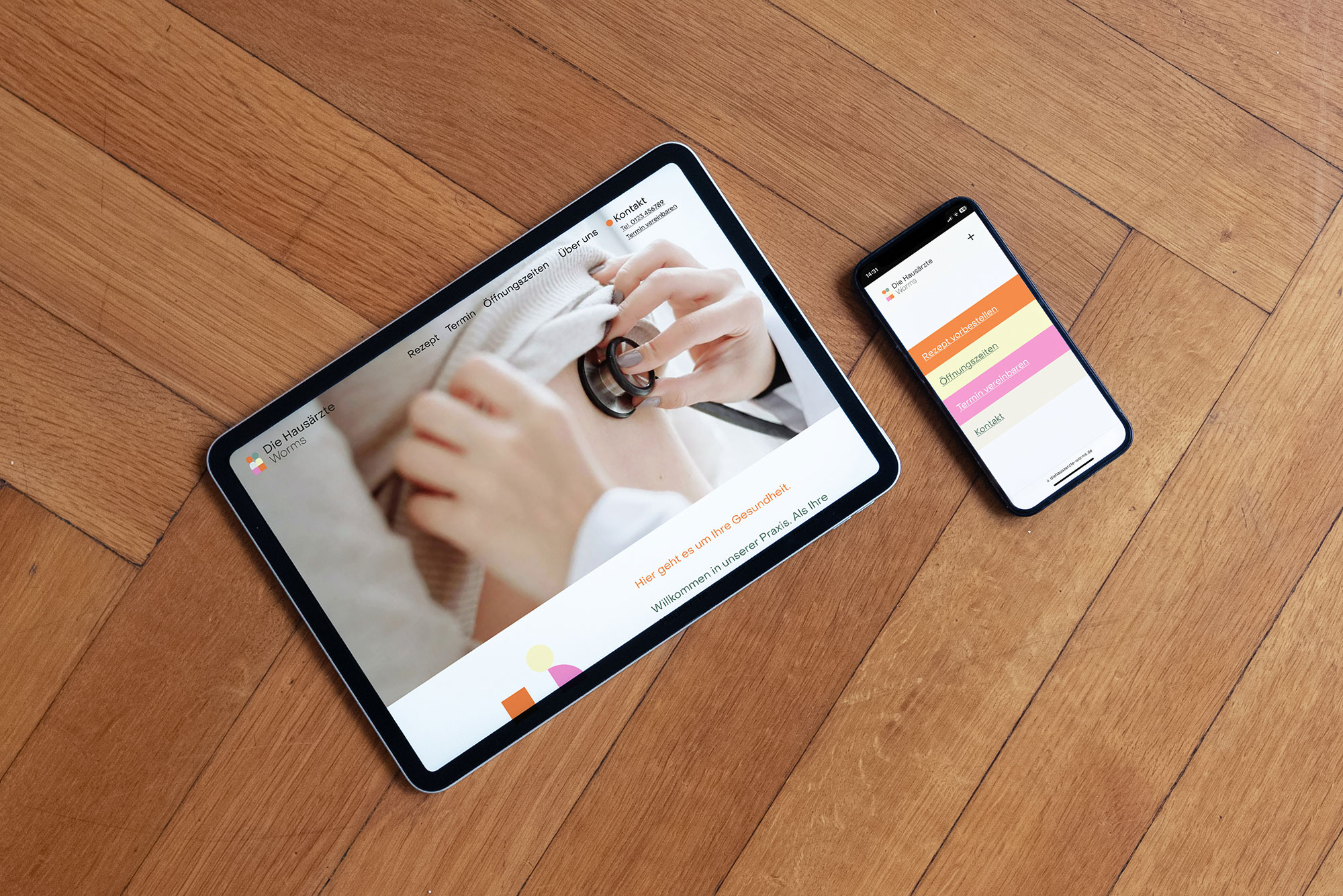
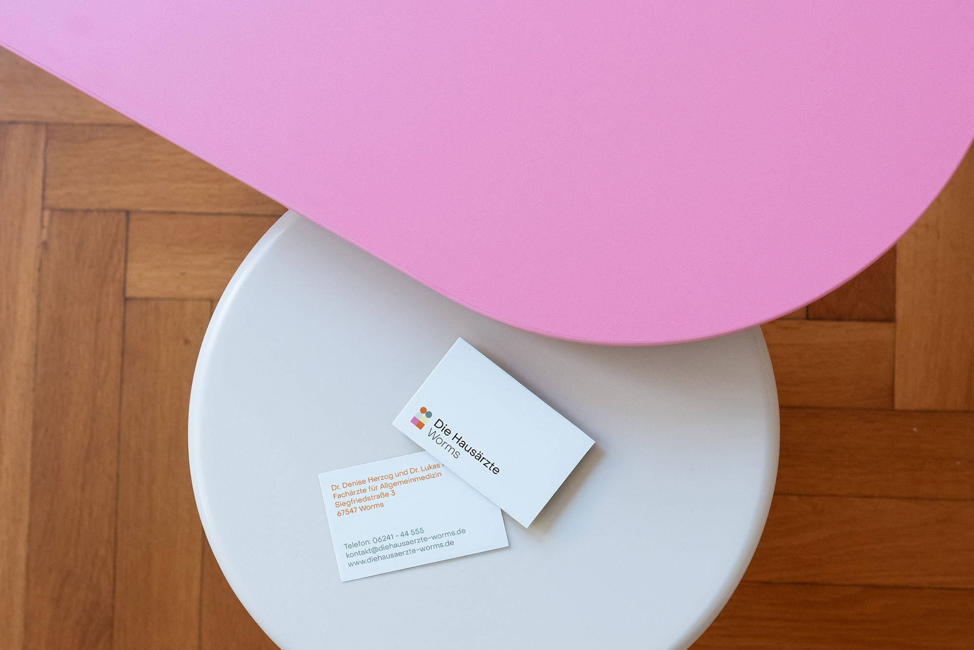
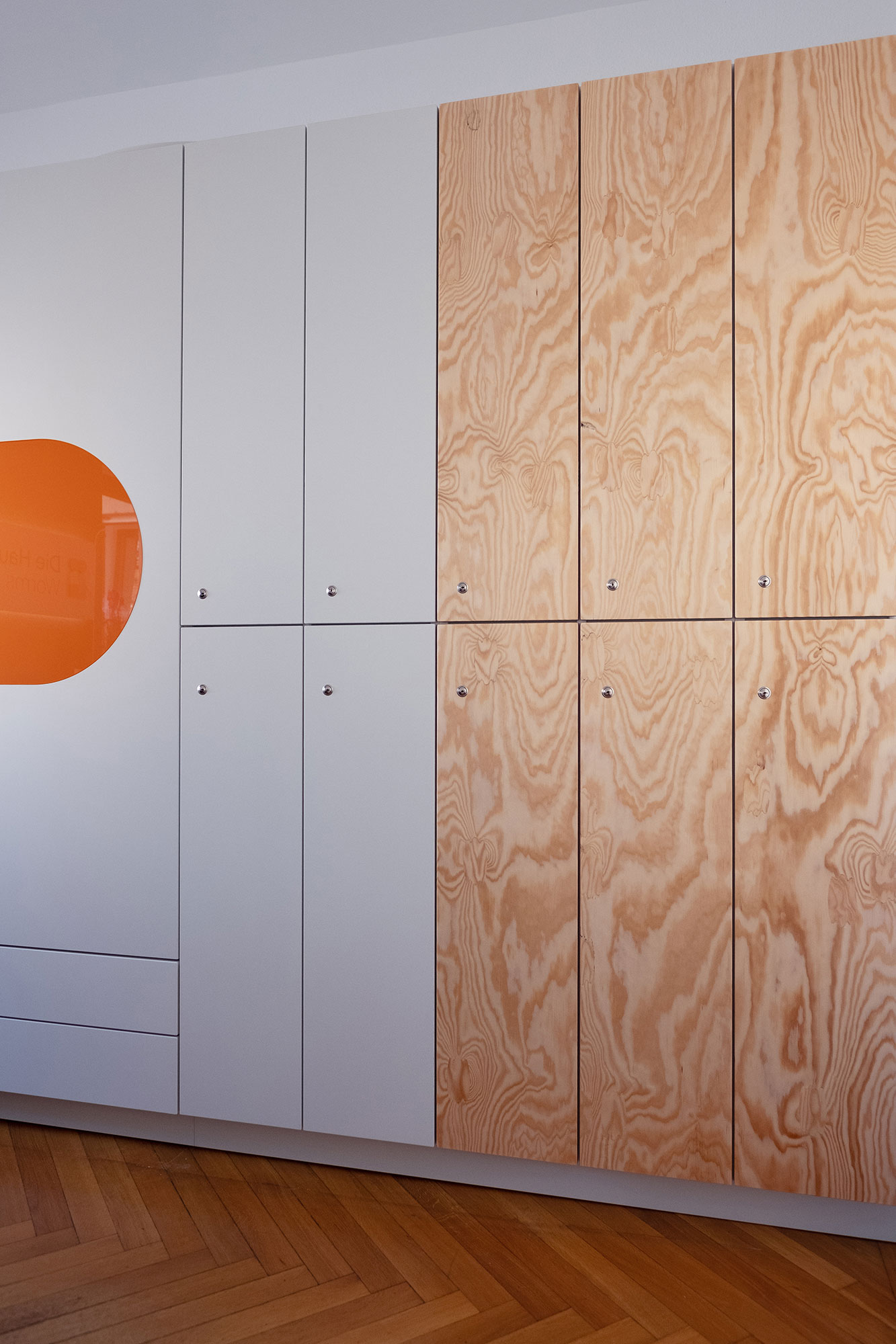
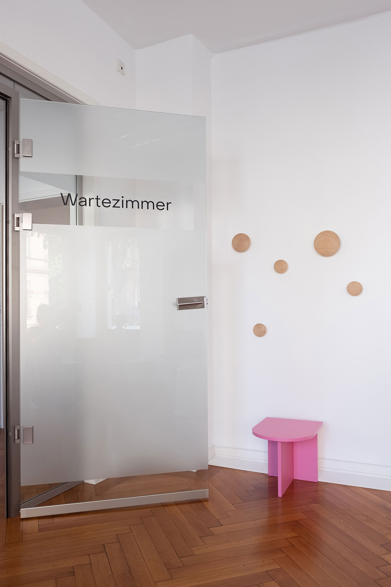
The graphic language of Hausärzte Worms is clear, accessible and positive. It combines fresh, lively colors and wood textures with geometric shapes and functional typography.
It is not only the media design that makes use of these design components. In this project, the corporate design was also the basis for the interior design. The practice rooms furnished by Mayer Möbelmanufaktur have turned out really great and it’s a dream to see your own brand design interpreted so well by other trades.
Die Hausärzte Worms always communicate clearly and comprehensibly so that patients can understand their illness themselves. This helps them to take better responsibility for their health and empowers them to act.
“Listen to the patient” is not just a principle, but a promise. It is absolutely self-evident that everyone deserves respect – and not just because this is the basis for successful medical care.
The memorable logo stands for the two doctors in the practice on the one hand and for the connection between doctor and patient on the other. Dialogue and eye level are visualized here.