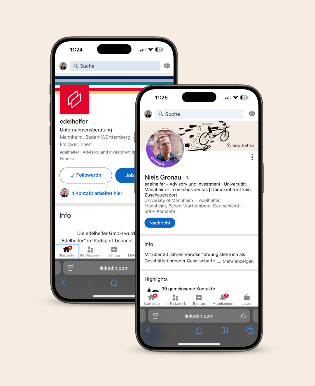
Edelhelfer (domestique in English): In road bicycle racing, a domestique is a rider who works for the benefit of their team and leader, rather than trying to win the race.
My client edelhelfer is a consulting and research firm based in Mannheim, Germany, founded in 2011. They focus exclusively on the sports and fitness industry, helping clients—such as gym operators, equipment brands, aggregators, and investors—achieve their strategic goals through tailored market research, advisory services and upcoming investment offerings.
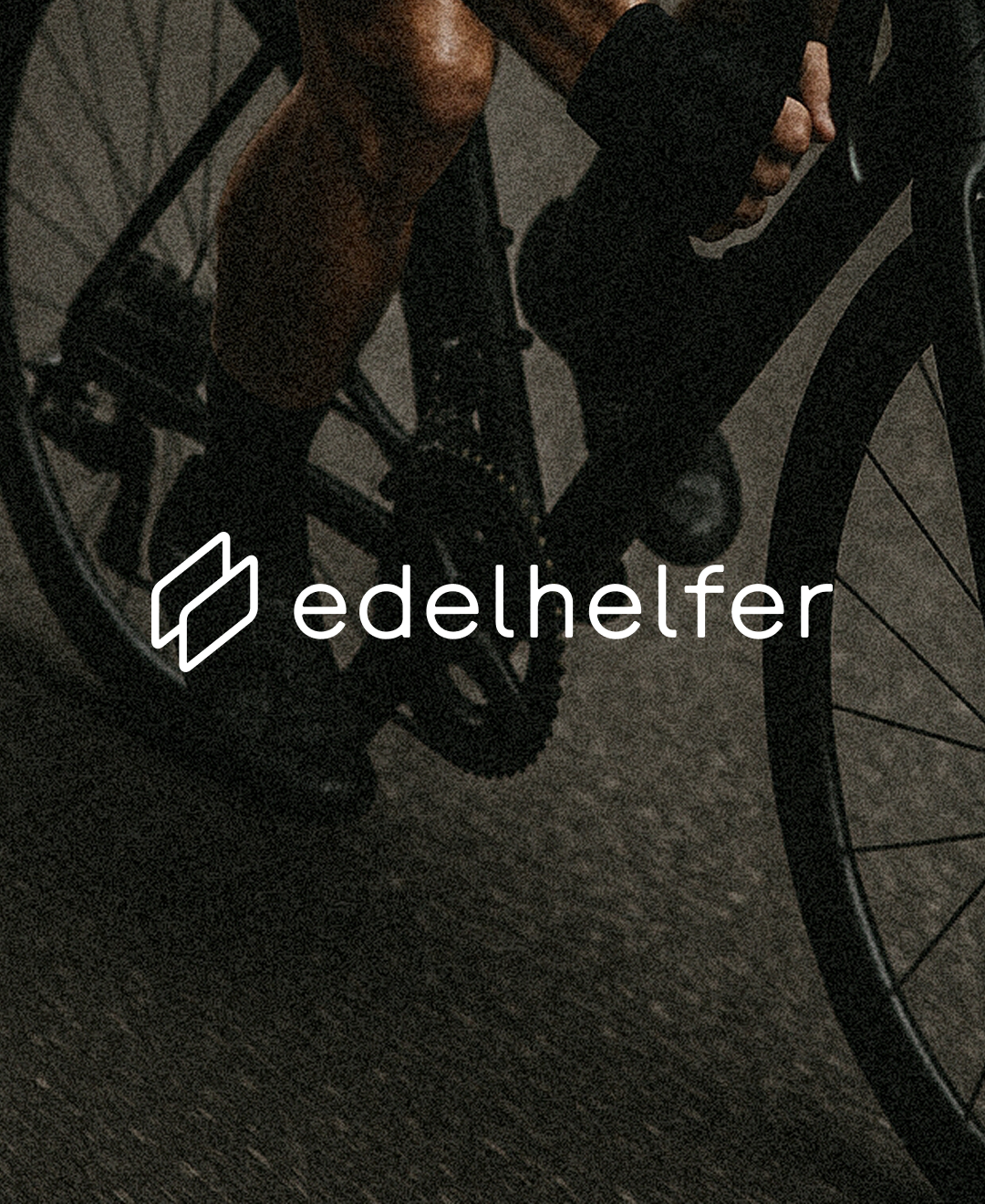
The brand design is obviously linked to the world of cycling, but goes beyond it.
The logo is minimalistic and easily recognizable—two abstract, parallel shapes that can symbolize movement and support serve as the figurative mark.
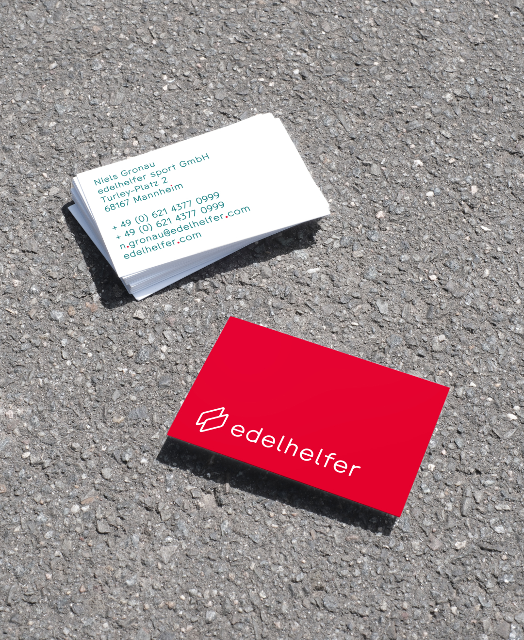
Strong, bright colors combined with plenty of white space and neutral beige tones dominate. This creates an energetic, dynamic, and high-quality look. The clear, sans serif typography emphasizes professionalism and zeitgeist.
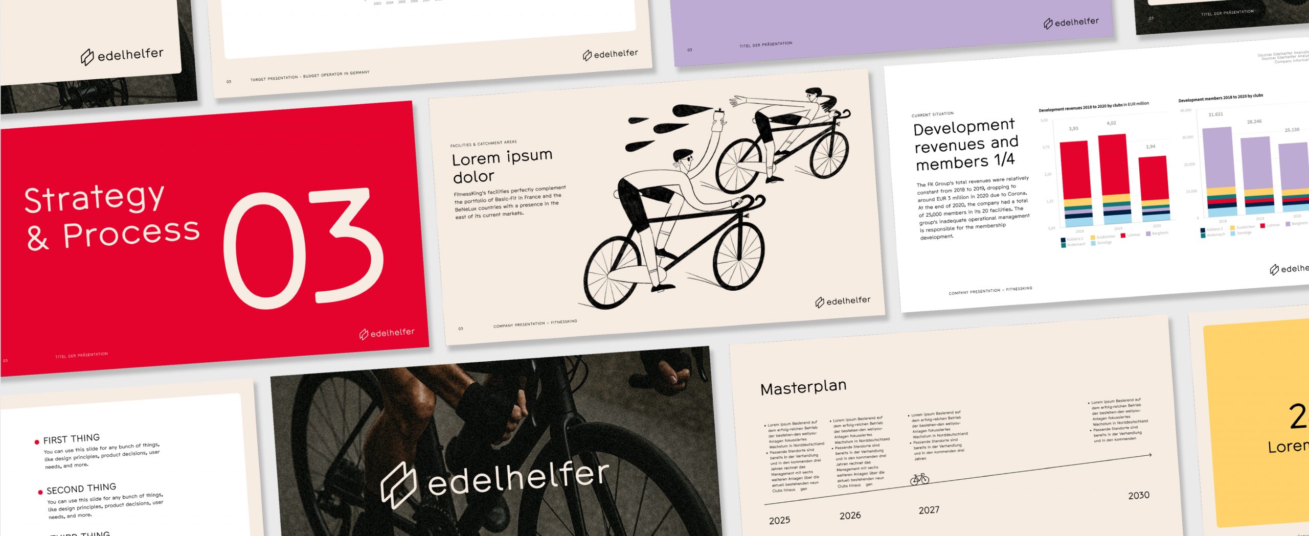
Consulting is naturally all about facts and figures. The factual and clean design of tables, lists, and informative texts are an important part of the corporate design. Added to this is a powerful, rather dark, serious imagery– after all, the brand is about business, and just like in sports, hard work is required!
The emotional level must not be neglected – in the end, it is always about people who need to be addressed and convinced. Friendly and approachable elements such as the color scheme and the humorous illustrations by Lada Chizhova represent this aspect of the brand.