OSCHÖN Naturkosmetik-Shop

2021
Corporate Design

stationary design

The natural cosmetics onlineshop OSCHÖN specializes in skincare for sensitive skin. The team loves mild natural cosmetics, knows it well (after all, the founder Kristina has a PhD in chemistry!) and is happy to share its knowledge. Oschön is all about targeted care products and a good (skin) feeling.

logo Design
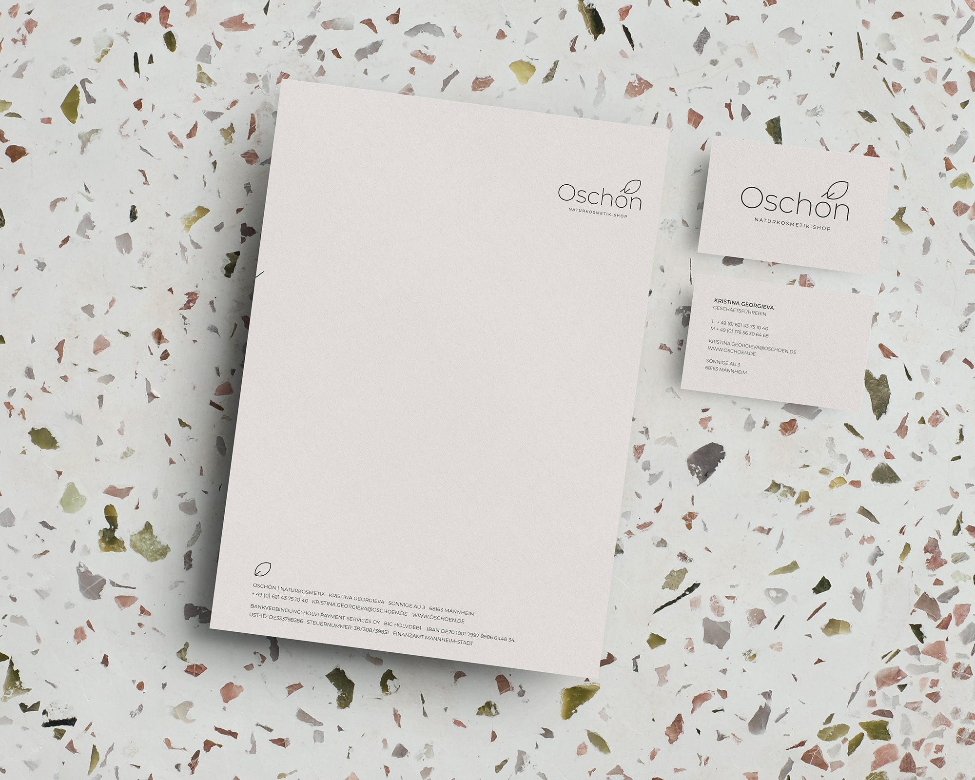
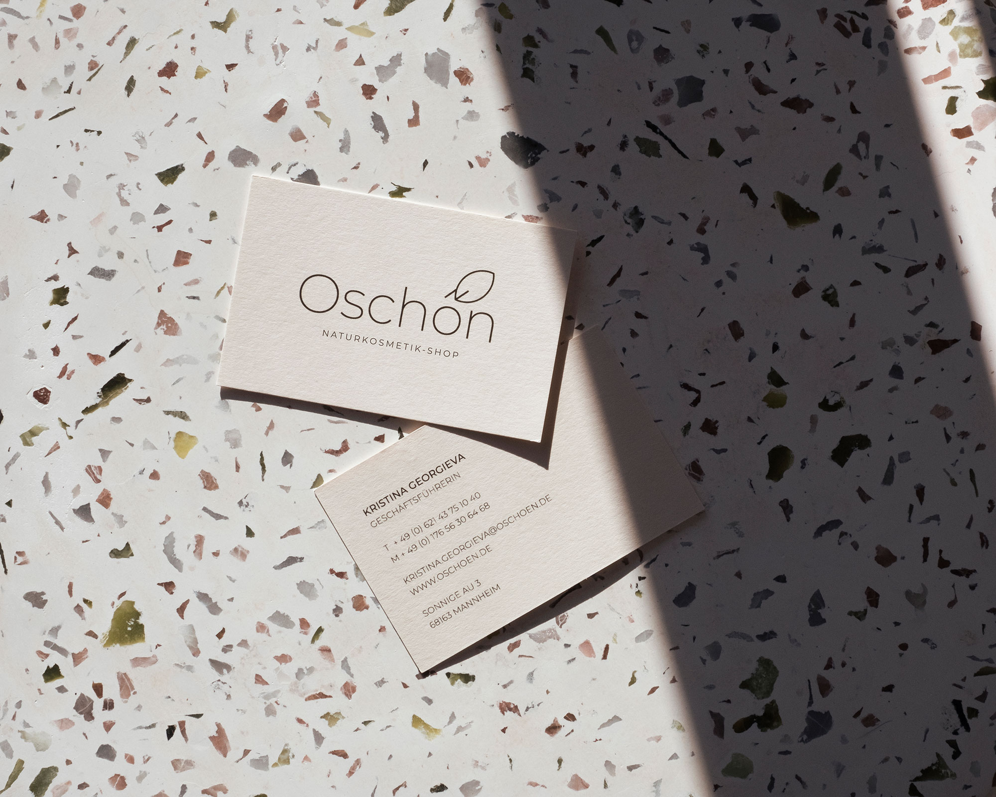
The name OSCHÖN stands for the sensual side of natural cosmetics. Because skin care with precious plant oils and natural extracts is just sooooooo beautiful. The adjective „schön“ meany beautiful in German. The logo is businesslike, modern, yet feminine. There are no unnecessary frills – and thus it perfectly reflects the company’s philosophy.
oschön design

OSCHÖN communicates with businesslike, clear and open-minded typography. The color world moves within soft natural tones with dark accents. Small, loving details such as the leaf as a submark and illustrative element contrast with the otherwise restrained, geometric design language.